There are many theories about its origin, but I think it's been about three years since responsive web design appeared. Nowadays, there are quite a few cases where Japanese sites have adopted it. In addition, many methods have been introduced in books and on the web. Here, including a reconfirmation, we will use a sample to explain the basic correspondence from liquid layout to responsive using media queries.
Coding for responsive web design with media queries
There are other methods as preparation before coding for responsive web design with media queries, but considering the ease of migration, I think liquid layout is easier to use.
- ・Point 1)
- As for the width, instead of fixing it in px, it is basically in percent.
- ・Point 2)
- It is convenient to add margins and padding to inner elements.
- ・Point 3)
- Good use of floats.
・Point 1) The width is not fixed in px, but in percent.
In order to optimize the layout according to the device, when the width of the window changes, the width of the content is also changed by a percentage. In other words, it uses traditional liquid layout techniques.
In the sample below, specify 80% for #main and 20% for #side.
* Other elements that do not specify a width are basically 100% width.

Specify a fixed width (arbitrary) for the outline (#wrapper) of the above sample.
For example, a width of 920px will change from liquid to fixed layout.
・Point 2) It is more convenient to add margins and padding to inner elements.
If the margins and padding are set in pixels for elements whose width is specified as a percentage, not only is the calculation cumbersome, but it also causes the layout to collapse.
There is also a way to consistently specify margins and pixels in percentages, but since it is also variable, it often results in an unintended layout.
Therefore, #main of sample01 specifies the width as a percentage, encloses the inner element with .main_inner, and gives it a fixed padding width (10px in the sample). Even when the window width is changed, the padding is 10 pixels. remain.
Even if the margin between elements whose width is specified as a percentage is changed by adding a margin to the elements enclosing each element, the margin between elements is kept constant.
・Point 3) Make good use of floats.
For the li element of the round frame part (.something) in the sample below, float it and dare to specify a fixed width so that the element wraps around when variable (horizontal width shrinks).
apply media queries
Try applying media queries based on the above points
First set a breakpoint
A breakpoint is a device (window) width boundary that switches the style to be applied.
The following settings are commonly specified:
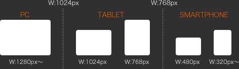
Using the above breakpoints as a reference, I actually used media queries in the sample.
In the sample, the css for each breakpoint is described as follows.
/* First, change from fixed layout to liquid. */ } @media screen and (max-width: 768px) { /* Describe css for each breakpoint */ /* By unfloating the #main and #side columns and making them 100% wide */ /* Change from left and right 2 columns to vertical 2 rows. */ } @media screen and (max-width: 480px) { /* Describe css for each breakpoint */ /* Double the headline and shoulder. */ /* Move global menu to header. */ /* Unfloat the article (something) in the main content and align it vertically. */ } @media screen and (max-width: 320px) { /* Describe css for each breakpoint */ /* Compact the global menu. */ }
@media screen and (max-width: 1024px) { /*各ブレークポイントごとのcssを記述*/
With the above description method, if the window size is smaller than the width of the breakpoint, the style in the breakpoint description is applied, but other styles are specified outside of media queries as being larger than the current breakpoint. Note that the style that was done is still going.
Finally, specify the viewport.
<meta name = "viewport" content = "width = device-width, initial-scale = 1, user-scalable = no">
This time, I briefly introduced the method of "Basic response from liquid layout to responsive using media queries", but it is just one example, and I think there are many other methods.
In fact, I think that there are many cases where a detailed response is required for each case.
Next time, I will introduce how to support responsive web design using media queries and javascript (jQuery).


