
It is very troublesome to check the display of each device every time when proceeding with the production of responsive web design.
A tool that can simulate each device on the browser is convenient in such a case.
Tools include browser defaults, extensions, and bookmarklet versions.
In addition, some can be operated on the browser.
This time, I would like to introduce some of the many tools available.
Use Firefox's Responsive Design View feature.
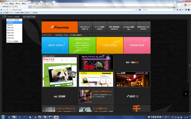
First, enter the URL of the site you want to check and operate the following on the menu bar.
Tools > Web Development > Responsive Design View will display a panel on the upper left where you can switch the resolution.
The operation is very simple and easy to use.
It is convenient to cut vertically and horizontally easily.
Check with chrome developer tools.
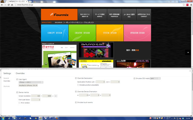
Display the site you want to check.
Go to Menu>Tools>Developer Tools and operate,
Display the operation panel.
When the panel is displayed, click the gear icon in the lower right.
Then the setting screen is displayed, and you can specify the device and device width.
Operation may be difficult to understand if you are not used to it
It is attractive that detailed settings can be specified for each User Agent.
Use "Responsive Inspector" with chrome extension.
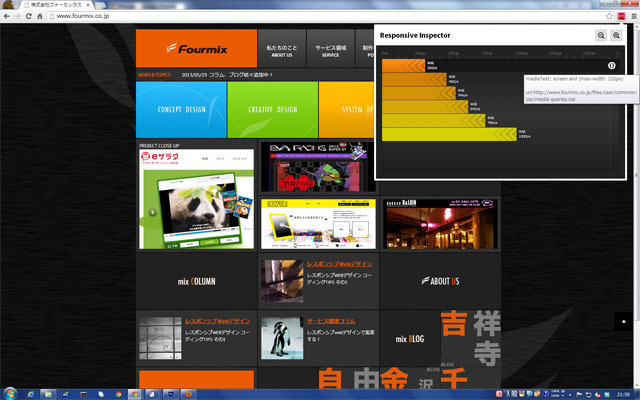
First, add "Responsive Inspector" to your chrome extensions.
You can get it by navigating to the following URL in chrome.
https://chrome.google.com/webstore/detail/responsive-inspector/memcdolmmnmnleeiodllgpibdjlkbpim
When you add "Responsive Inspector", an icon is added to the upper right of the chrome menu bar.
Display the site you want to check and click the icon.
Each breakpoint marked as using mediaqueries on your site is clearly displayed in the form of a bar chart.
Clicking on the bar graph display for each width will change the window width to that width.
Also, you can check the css that is set for each breakpoint.
When writing media queries,
Code often tends to be cumbersome.
In such a case, it is very convenient to see the css for each breakpoint in "Responsive Inspector".
You can also use it to see the breakpoint settings of the site you want to refer to.
Use the bookmarklet "Resizer" in Firefox.
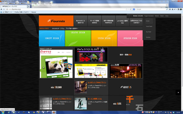
You can get it by moving to the following URL with Firefox.
http://codebomber.com/jquery/resizer/
After obtaining it, "Resizer" will be registered in the bookmark bar of Firefox.
Display the site you want to check and click "Resizer" on the bookmark bar to display the operation panel on the upper right.
The operation method is also very simple and easy to understand.
Use Screenfly.
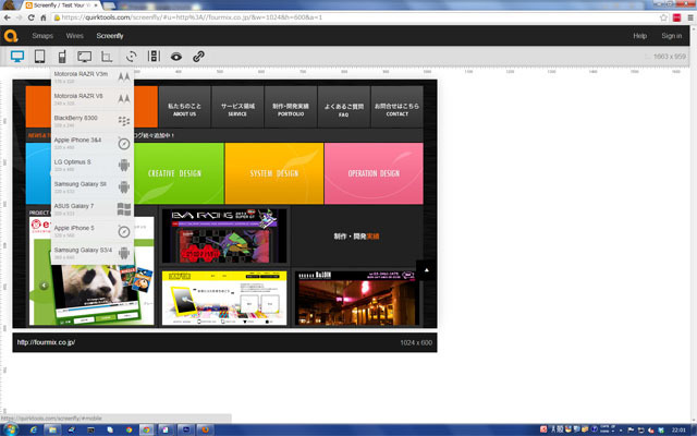
Access the site below.
https://quirktools.com/screenfly/
When you go to the "Screenfly" site, the URL input field is displayed, so enter the URL of the site you want to check. Click the "Go" button.
There is an operation panel at the top of the page, so select the device you want to check.
Devices include PCs, tablets, smartphones, and TVs, and you can select a major size or model.
The icons are easy to understand and easy to operate.
It's also nice that it works in every modern browser.
This concludes our introduction to responsive web design check tools.
In addition to the tools introduced here, there are many check tools available, so please use the one that suits you best.


